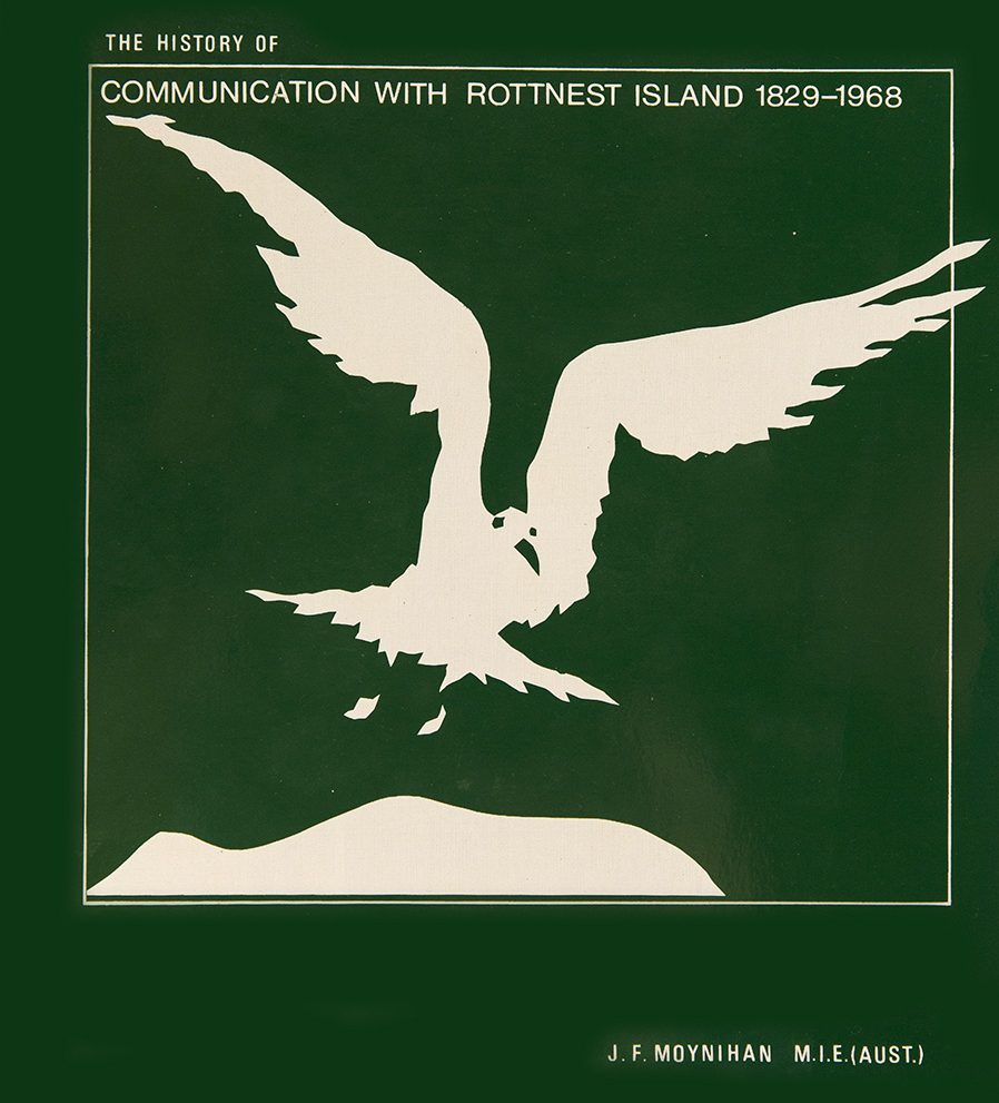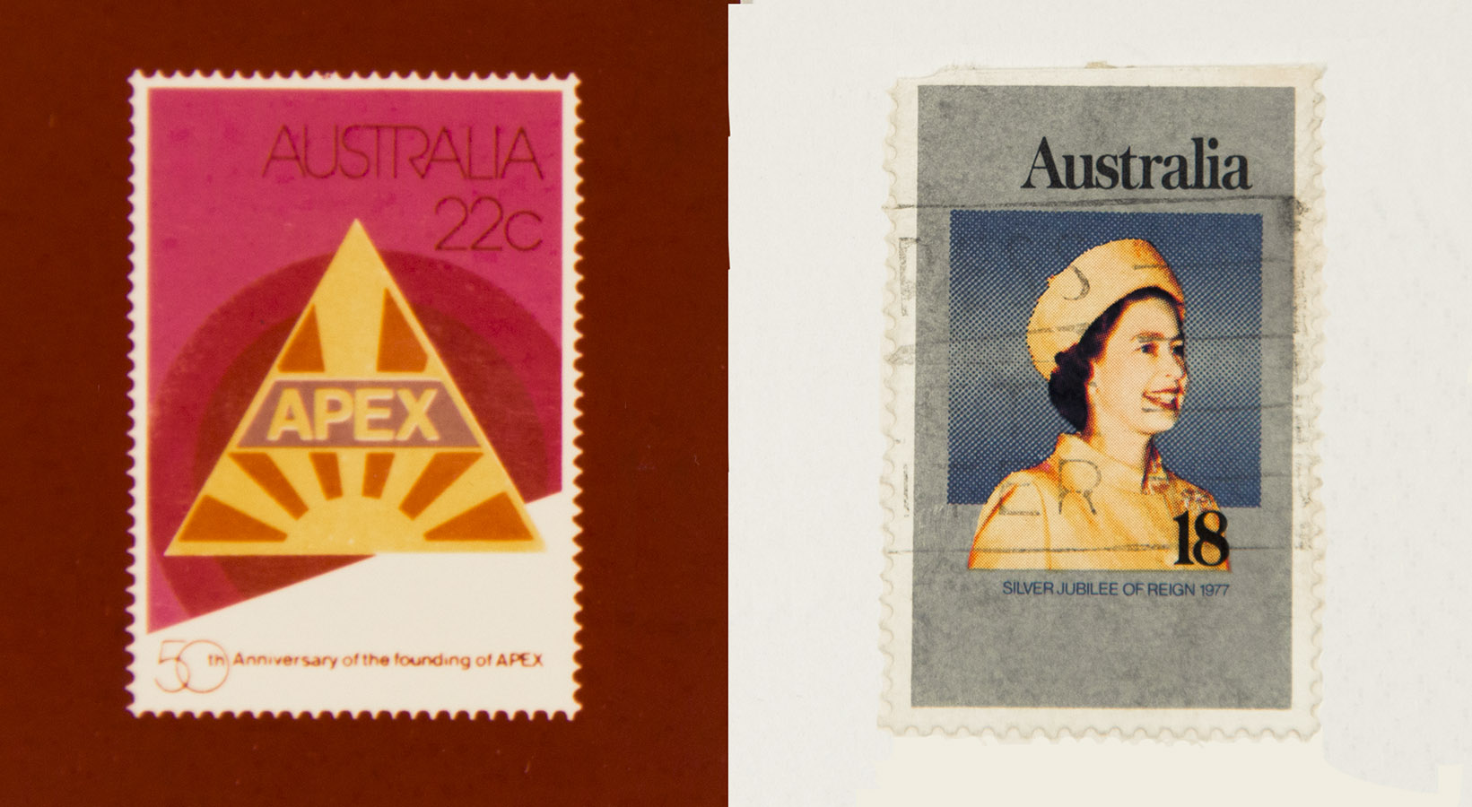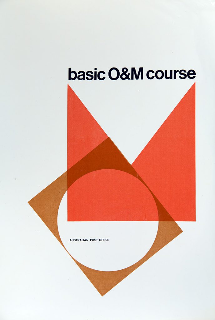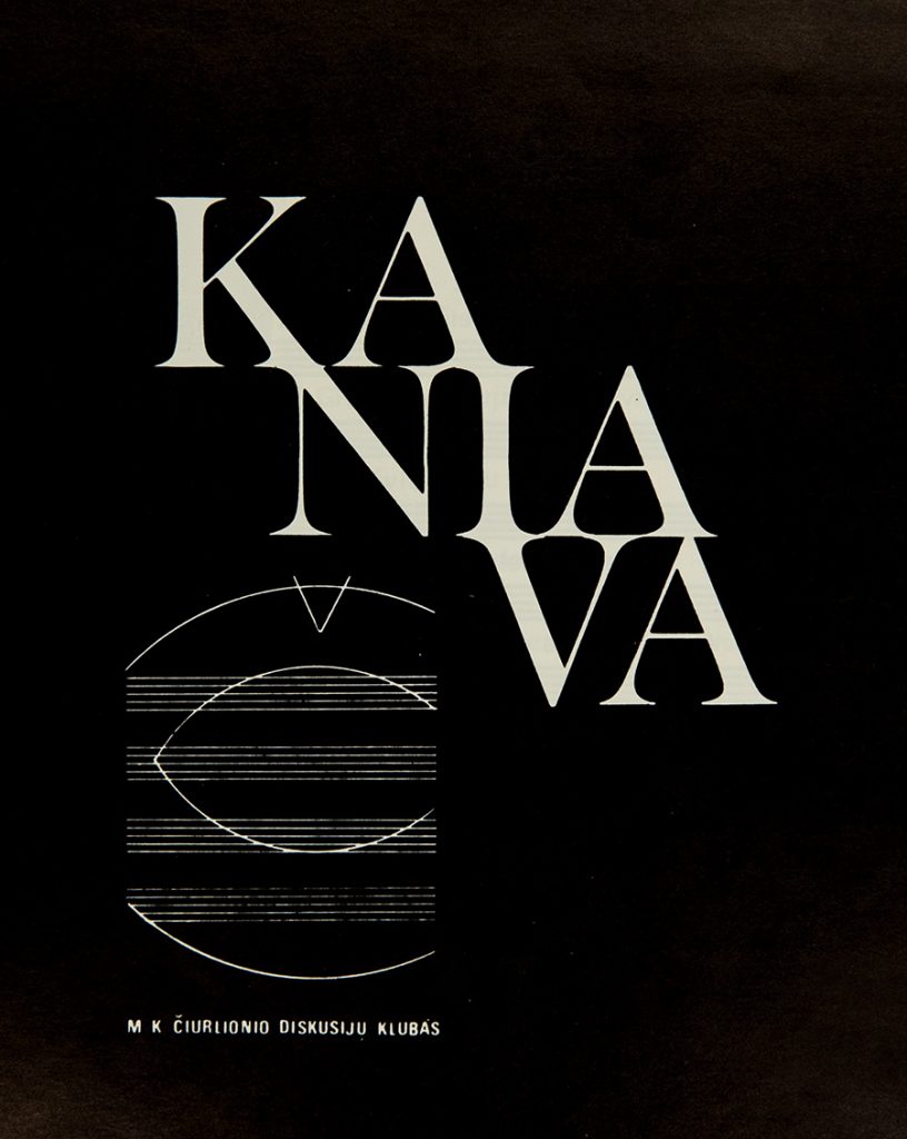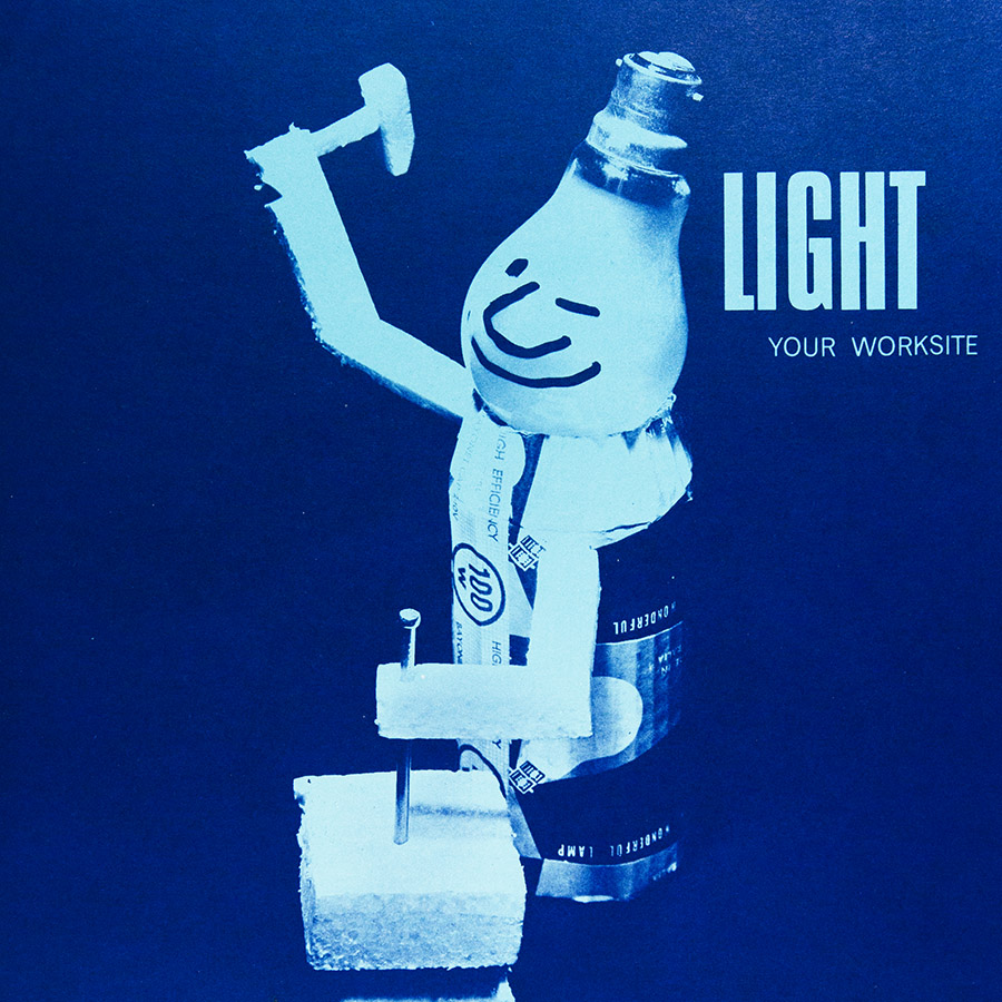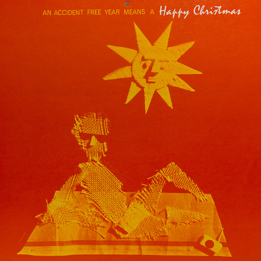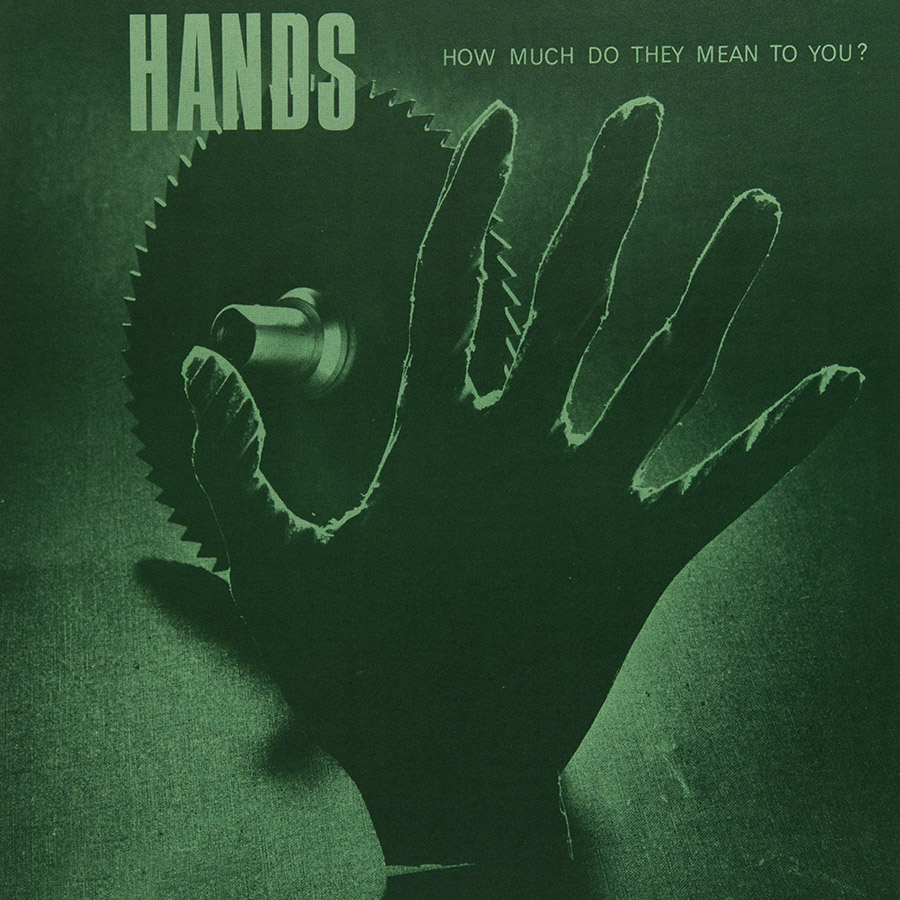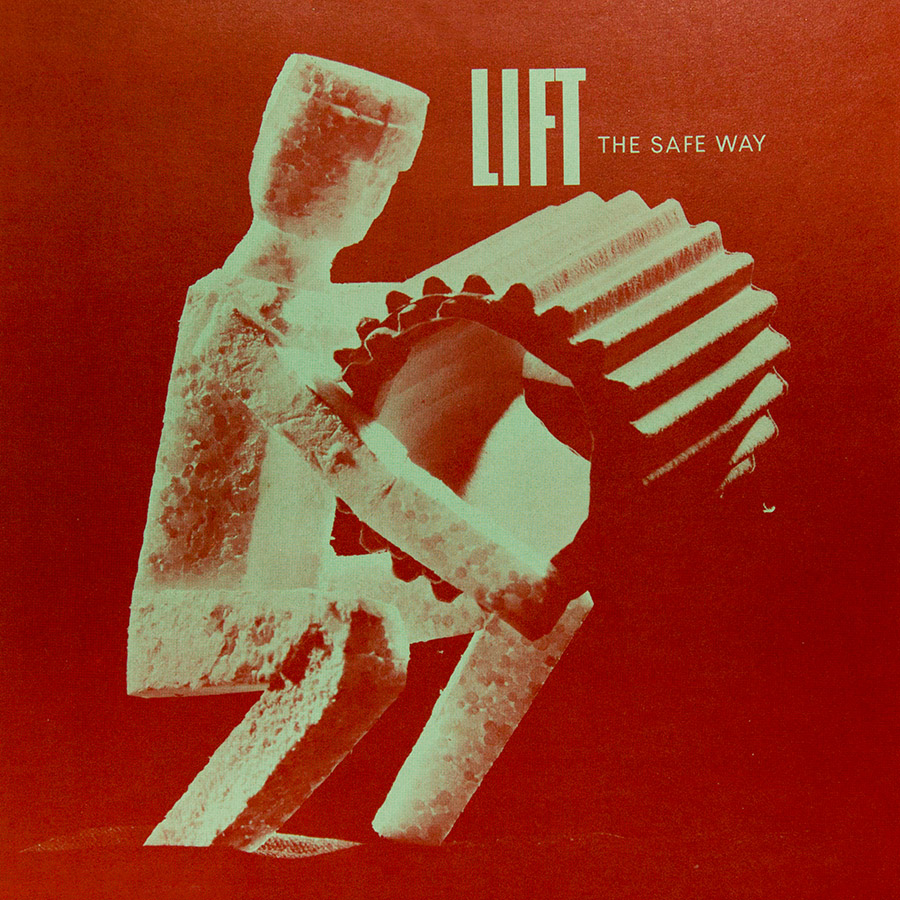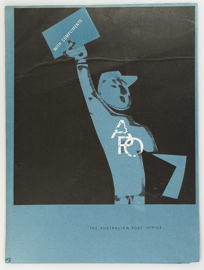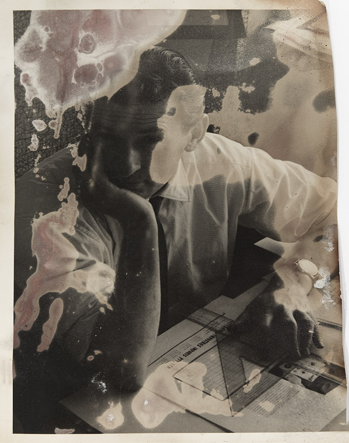
Surviving picture : set on fire, doused and resurrected from a house fire, the only image remaining from Viktor’s freelance days in Elizabeth Towers on Royal Parade and Grattan Streets in Parkville
- Changing directions in design
- Breaking rules to produce catchy results
- Machines, concepts, high contrast photography
- Graphic design did not = graphic art
Inviting art into graphic design
From the thin-line shoe sketches of Andy Warhol in New York to the film posters of Saul Bass, New York was leading the Mad Men of Madison Avenue and the rest of the world in a change of direction with how advertising would need to follow. Australia, always aware of the trends was keen to adopt a new perspective.
With a few clients willing to open their ideas to a new wave, graphic Design began to become graphic Art and with the change of idea, many artists became involved in the process of convincing the public to spend money.
The 70’s introduced a larrikanism based on soft sex and when the belief was that it was the ways to sell everything from leisure suits to hot chicken offal rolls, some areas of sobriety had a decency to follow a much more sophisticated approach and keep advertising images to more “decent” ideas.
Photography was adopted as the new form of imagery and gave illustrative advertising a hiding, so the question was how should it be delivered – blatant product, sweet pretty facials, or photographic conceptuals? The Australia Post was a pillar of respectability so adopted only one approach, integrity.
Minimal waves
Streamlining ideas for maximum impact
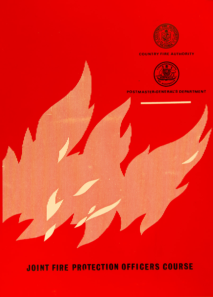
High contrast
Low maintenance
The PMG transition to Australia Post
Adding 60’s to 70’s
Concentrating ideas and forming brands
Every business was needing to establish an identity within the exploding competitive world they were fishing in. A strong brand helped them differentiate from a flood of similar practices.
Playing with shapes was like finding ink had a new cousin: a fatness and a volume that wasn’t available in a 2 dimensional world. Hey, let’s take a photo of that!

