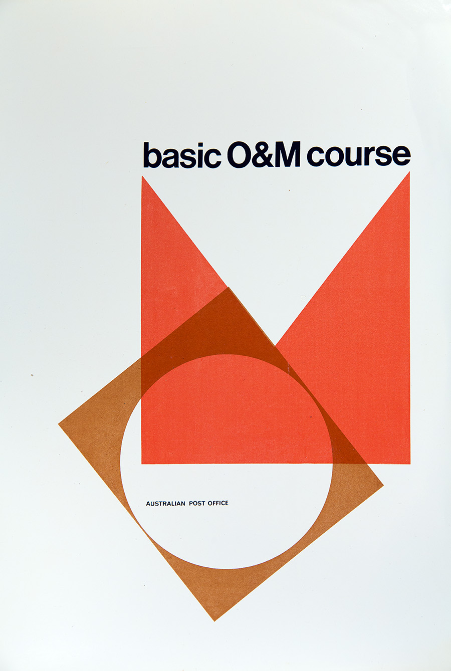
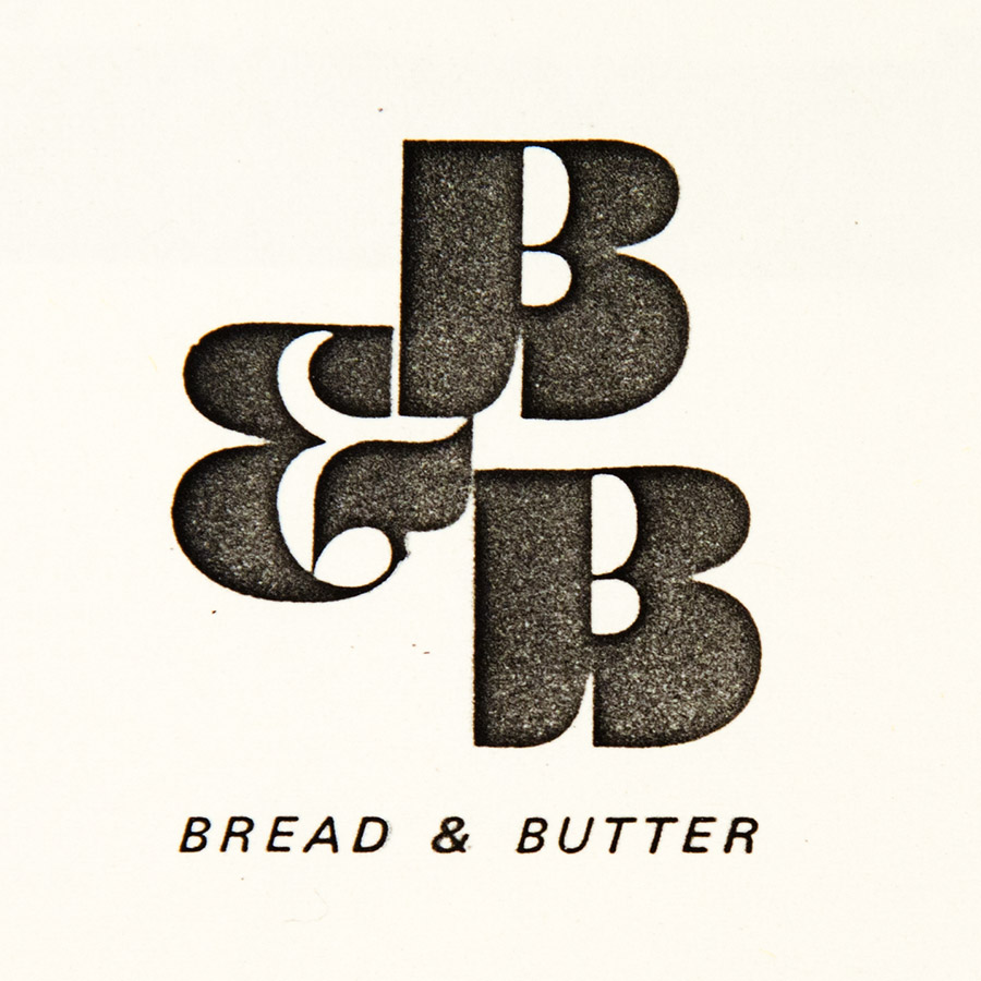
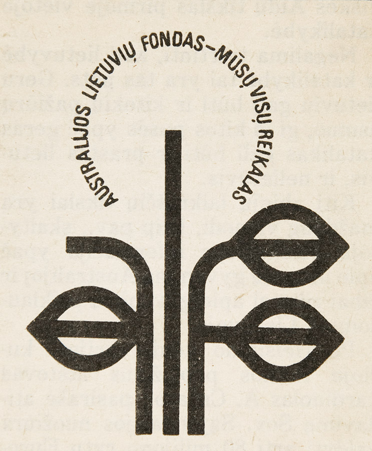
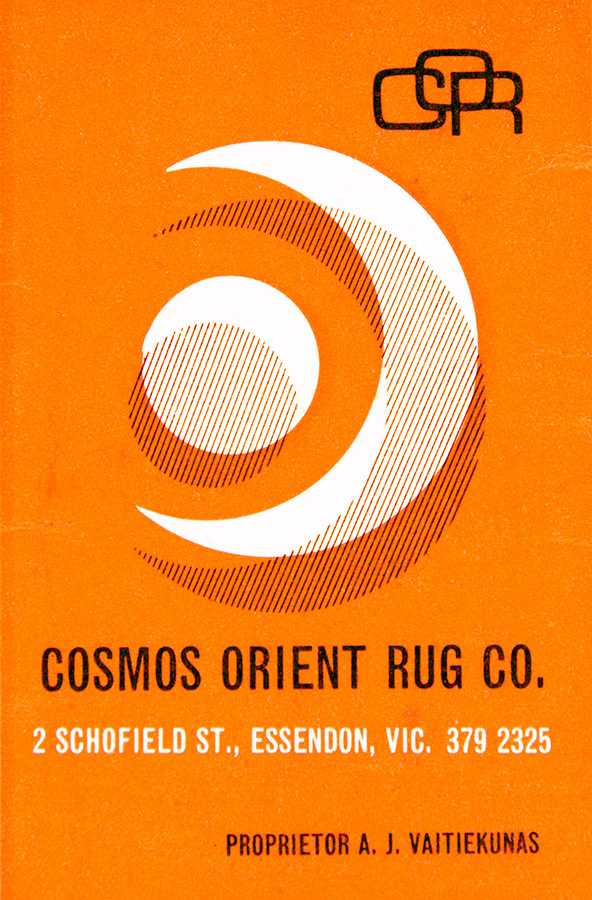
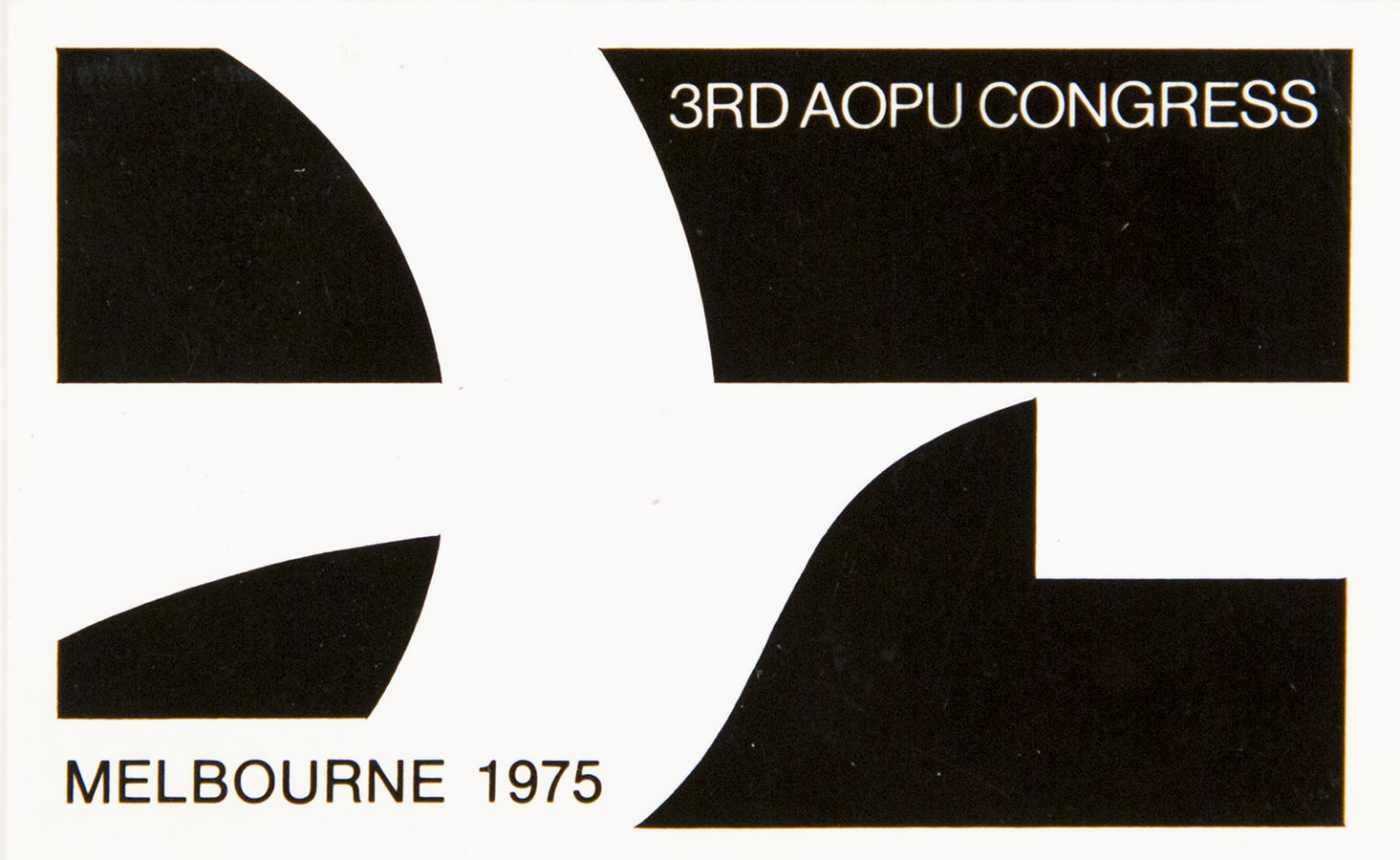
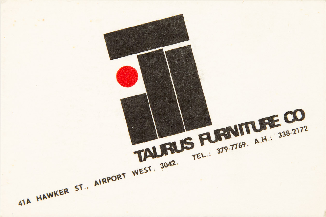
Logos are the wonderful pastimes of a graphics person – how to best describe a whole entity in just one quick image
What does the logo mean?
Does it sum up the image of the product?
Does it explain the position of the business in its world of competitiveness?
Does it make its competitor shudder?
Is it progressive?
Is it unique?
or does it simply follow the rest of the sheep into the paddock of slaughter?
“Less is more and keeping it simple aren’t just flippant words, they sum up the whole philosophy of Logo design”
It may be just a quick swish of a pen, or the observation of how letters overlap or combine from 2 sheets of Letraset that can inspire the result, but whichever way it happens, that combination can remain locked in perpetuity in the minds of every consumer, that’s what makes the challenge of desiging something unique and immediate so wonderful – and at the same time, so challenging.
“You want complex? here, it’s ready. Want simplicity? that will take time.”
“You can start with many thoughts then slowly, you begin to realise that this part and this little bit, they are redundant, and soon, all you have left, is the fragrance of the original, that becomes the logo.”
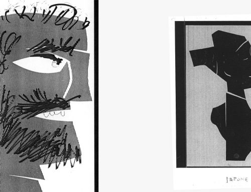
And if it works in Black & White, you have the truest essence
